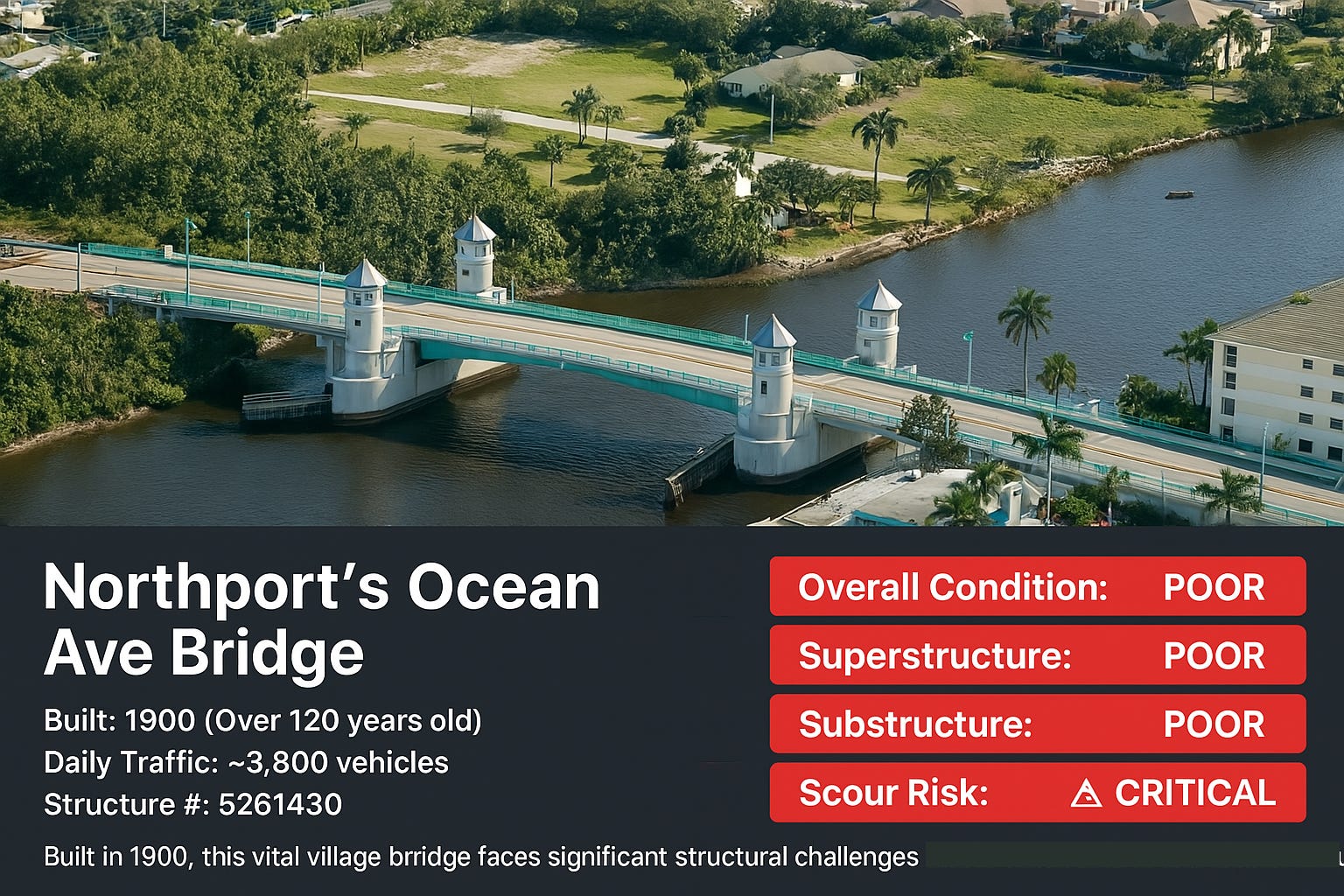
How to make AI draw properly
AI tool-hopping: the secret to creating professional illustrations

How do you present your research with AI illustrations? How do you get rid of the hallucinations and awful design choices? Here are three real-world examples showing how to combine ChatGPT, Claude, and Gemini to create accurate and useful AI illustrations without the usual design disasters. And some research.
Let me show you how this works with three examples.
1. The car rental small print
I faced once the classic rental car dilemma: my credit card company offered "free" rental insurance - which came with a 31-page document of terms and conditions. Should I go for it or use the car rental insurance? Sure, I could have spent hours reading the fine print, highlighting suspicious clauses, and probably still missing the really sneaky stuff.
Instead, I turned this into an experiment: could AI help me decode the hidden traps in rental car insurance? I asked Claude to analyze the document with a specific focus - find the clauses that could cost me the most money in scenarios I might never anticipate.
Step 1: be lazy
The process was fascinating. First, I needed a prompt that would make the AI think like both a suspicious insurance lawyer and a helpful consumer advocate:
Regular readers know my approach - never write prompts from scratch when you can make AI do it. The resulting prompt was massive, but it got us one crucial insight: these sneaky clauses can void your ENTIRE coverage, not just specific incidents - and you wouldn't even know you violated them. I asked to give just 5 out of the 29 (!) red flags:
Step 2: Everything including the kitchen sink
I asked Claude to write illustration instructions for ChatGPT. The result was... special. Think "design by committee”. Duplicate risk amounts, tips playing musical chairs with their sections, and warning symbols having an identity crisis. My favorite part? None.
I went back to the cooking instructor Claude with the failed soufflé and asked it to identify where the recipe went wrong. It improved the prompt. The illustration got better.
Each round I saw new improvements. Claude would look at a half baked illustration and go "Ah, I see the problem." The instructions got shorter, clearer, more precise. By version 6 (or 7? The failures blur together): three traps, clear explanations, simple icons. The whole process took 14 minutes - probably faster than reading the first page of that insurance document. This is what ChatGPT came up with:

Time for a reality check. After making such a nice illustration about hidden traps in rental car insurance, I had to verify if Claude wasn't hallucinating.
2. The dangerous bridges
I fed it a 5MB dataset, thanks Andy, and asked: "Find me story ideas in here." Gemini came back with some decent suggestions, including "Hey, look at these old bridges from the 1800s!" Not bad, AI, not bad.
New York's Oldest Bridges: Focus on the oldest bridges listed in the dataset, particularly those built in the late 19th or early 20th centuries (e.g., one built in 1895, another in 1907, 1906, 1885 ).
But you know me - I never trust AI's first answer. So I made it focus: "Show me bridges built before 1910 that are in poor condition." That's when it got interesting.
Out popped the Ocean Avenue Bridge in Northport Village, Suffolk County. (Yes, I verified it's actually in New York because AI loves to casually relocate infrastructure to random places).
The data was concerning:
Built: 1900
Current status: "POOR" (those caps are from the official rating, not me being dramatic)
Daily traffic: 3,812 vehicles (I checked this number three times)
Bonus worry: "scour critical" (that's engineer-speak for "water might eat the foundation")
Time to make this visual. First try? Asked ChatGPT to illustrate it. The result looked like someone had described a different bridge to an artist:
Back to Claude for help writing better instructions. I uploaded the failed picture, gave the specific instruction not to touch the photo of the bridge at all and asked Claude how it would say that to ChatGPT. Finally we got a decent infographic showing the actual bridge with clear risk indicators - you can see it at the beginning of this post.
But wait - let's do one more check. Did AI modify the photo at all? I asked another AI to check. Turns out the image was a tiny bit processed by AI. Always verify:
3. The Emoji Gap
During my coffee break, I wondered: could this approach work for something less serious? Say, visualizing how differently parents and teens interpret emojis? You know, like how 👍 can mean "conversation terminated" to teens but "I'm pretending I understand you" to parents.
Started with Claude to craft the perfect emoji interpretations. It nailed the generation gap like:
🍆
TEEN: Sex.
PARENT: "My eggplants are coming in nicely this season!"
ChatGPT's first attempt at illustrating this looked like an emoji chart designed by someone who'd had emojis explained to them via interpretive dance. Back to Claude to analyze what went wrong and write clearer instructions.
Five attempts later, we finally got a clear infographic.
Three different subjects, same workflow - make AIs collaborate by letting each do what it does least badly:
Claude excels at analysis and writing clear instructions
Gemini 2.5 handles data surprisingly well
ChatGPT can draw (but needs constant supervision)
Is it perfect? Nope. Did I have to verify everything multiple times? You bet. But in the time it takes most people to read one page of fine print, I got:
A visual guide to rental car insurance traps (verified against the actual contract)
An infrastructure risk assessment (checked against bridge inspection data)
An emoji generation gap guide (tested on virtual teens and parents)
The secret isn't finding the perfect AI tool - it's making imperfect AIs work together while fact-checking everything they produce. Like conducting an orchestra where none of the musicians are particularly good, but somehow they make decent music when you force them to listen to each other.